This is why CM MES UI is not a closed system. The platform exposes deliberate extension points. In this post we will show two patterns, injecting our own wizard steps and entity pages by just leveraging metadata.
Overview#
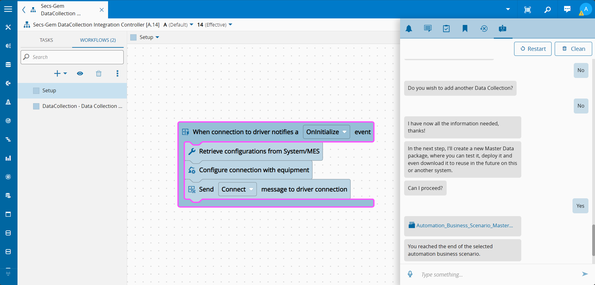
In the previous post we built an ephemeral OPC-UA controller that browses a server’s node tree on demand.
The back-end is done. Now we need to surface it in the UI:
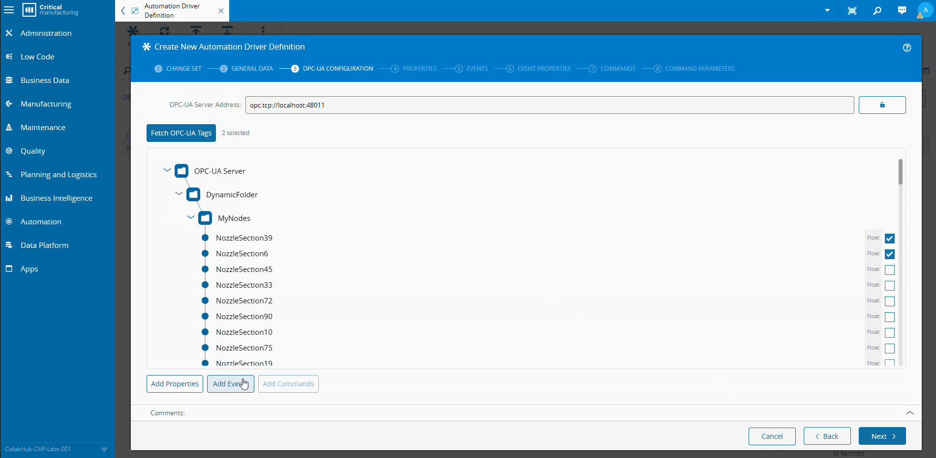
- A new wizard step inside the existing Automation Driver creation wizard — so users can browse the OPC-UA server and auto-populate properties, events and commands without typing node IDs by hand.
- A new entity page tab on the
AutomationControllerInstanceentity — so operators and engineers can open a live OPC-UA browser directly from the instance page while the controller is running.
Both are shipped as a single Angular library. No platform code changes. No forking. The entire integration lives in a metadata service.
The Customization Model#
Using the CLI with the cmf new html it will create an angular workspace. By running ng generate library we can now create our customization angular library. This library will have be generated with a secondary entrypoint for the metadata. This metadata will have a .module.ts and a .service.ts.
The MES UI customization system is built around PackageMetadata, generated in the .service.ts. You extend it, declare what your package provides, and the platform picks it up at startup.
@Injectable()
export class CustomizationOpcuaMetadataService extends PackageMetadata {

    public override get packageInfo(): PackageInfo {
        return {
            name: 'customization-opcua',
            loader: () => import('customization-opcua'),
            components: [
                'PageOpcUaBrowserComponent',
                'WizardAutomationDriverOpcuaStepComponent',
                'OpcuaNodeTreeComponent'
            ]
        };
    }

    public override get flexComponents(): FlexComponent[] { ... }
    public override get entityTypes(): EntityTypeMetadata[] { ... }
}
The packageInfo loader uses a dynamic import. This means the library is code-split and is only fetched from the server when the user actually navigates to a feature that needs it.
Two getters do the heavy lifting: flexComponents for wizard injection and entityTypes for entity page injection.
Injecting a Wizard Step#
Flex components are the mechanism for injecting UI elements into existing platform views. The descriptor answers three questions: which view, where inside it, and what to insert.
public override get flexComponents(): FlexComponent[] {
    return [
        {
            id: 'cmf-core-controls-wizard',
            context: 'cmf-core-connect-iot-wizard-automation-driver',
            subComponentsToAdd: [
                {
                    target: {
                        anchor: 'cmf-core-controls-wizard-step',
                        index: 2,
                        location: FlexComponentLocation.NextTo
                    },
                    components: [
                        {
                            component: () => import('customization-opcua')
                                .then(m => m.WizardAutomationDriverOpcuaStepComponent),
                            subComponent: 'cmf-core-controls-wizard-step'
                        }
                    ]
                }
            ]
        }
    ];
}
Breaking this down:
| Field | Meaning |
|---|---|
id | The component selector of the host widget (cmf-core-controls-wizard) |
context | The injection context. If defined, it will only apply if the context selector is an ancestor of the component |
anchor | The CSS selector of the sibling element |
index | Position relative to matching siblings (0-based) |
location | NextTo means insert as a sibling after the anchor at that index |
subComponent | The Angular component type that wraps the injected component inside the host |
In plain terms: find the Automation Driver wizard, locate the third wizard-step in it, and insert our step right after it.
The Step Component#
The step itself extends CustomizableComponent and declares a WizardStep child:
@Component({
    selector: 'customization-opcua-wizard-automation-driver-opcua-step',
    standalone: true,
    imports: [CommonModule, WizardModule, PropertyEditorModule, ProgressIndicatorModule, OpcuaNodeTreeComponent],
    templateUrl: './wizard-automation-driver-opcua-step.component.html',
    viewProviders: [{ provide: HOST_VIEW_COMPONENT, useExisting: forwardRef(() => WizardAutomationDriverOpcuaStepComponent) }]
})
export class WizardAutomationDriverOpcuaStepComponent extends CustomizableComponent {

    @ViewChild(WizardStep, { static: true })
    public wizardStep: WizardStep;

    public showStep = false;
    // ...
}
Two things matter here. First, the HOST_VIEW_COMPONENT provider — this is how the platform discovers your component when doing dependency injection walks up the component tree. Without it, services injected at the wizard level won’t reach your step. Second, @ViewChild(WizardStep, { static: true }) — the platform needs to find the WizardStep directive inside your component to register it in the wizard’s step list.
Conditional Visibility#
Not every Automation Driver uses OPC-UA. Showing the step for a SECS-GEM driver would be confusing. The component detects the selected protocol at runtime and hides itself when irrelevant:
    constructor(
        viewContainerRef: ViewContainerRef,
        private readonly lbo: LboService,
        private readonly messageBus: MessageBusService,
        private readonly ngZone: NgZone,
        private readonly feedbackService: FeedbackService,
        private readonly utilService: UtilService,
        @Optional() @Inject(WizardAutomationDriver) private readonly wizard?: WizardAutomationDriver
    ) {
        super(viewContainerRef);
    }
(...)
    public async ngDoCheck(): Promise<void> {
        if (this.wizard?.instance?.AutomationProtocol != null &&
            this.wizard.instance.AutomationProtocol.Id !== this._automationProtocol?.Id) {

            const getProtocol = new Cmf.Foundation.BusinessOrchestration.ConnectIoTManagement
                .InputObjects.LoadAutomationProtocolItemsInput();
            getProtocol.LevelsToLoad = 1;
            getProtocol.AutomationProtocol = new Cmf.Foundation.BusinessObjects.AutomationProtocol();
            getProtocol.AutomationProtocol.Id = this.wizard.instance.AutomationProtocol.Id;
            this._automationProtocol = (await this.lbo.call(getProtocol) as any)?.AutomationProtocol;

            this.showStep = this._automationProtocol?.Package?.includes('driver-opcua') ?? false;
        }
    }
WizardAutomationDriver is injected via @Optional() @Inject(WizardAutomationDriver), it is the host wizard’s data context. When the user picks a protocol, ngDoCheck fires, loads the protocol entity, checks whether the package name contains driver-opcua, and toggles showStep. The template binds this directly to [isHidden]="!showStep" on the wizard-step.
What the Step Does#
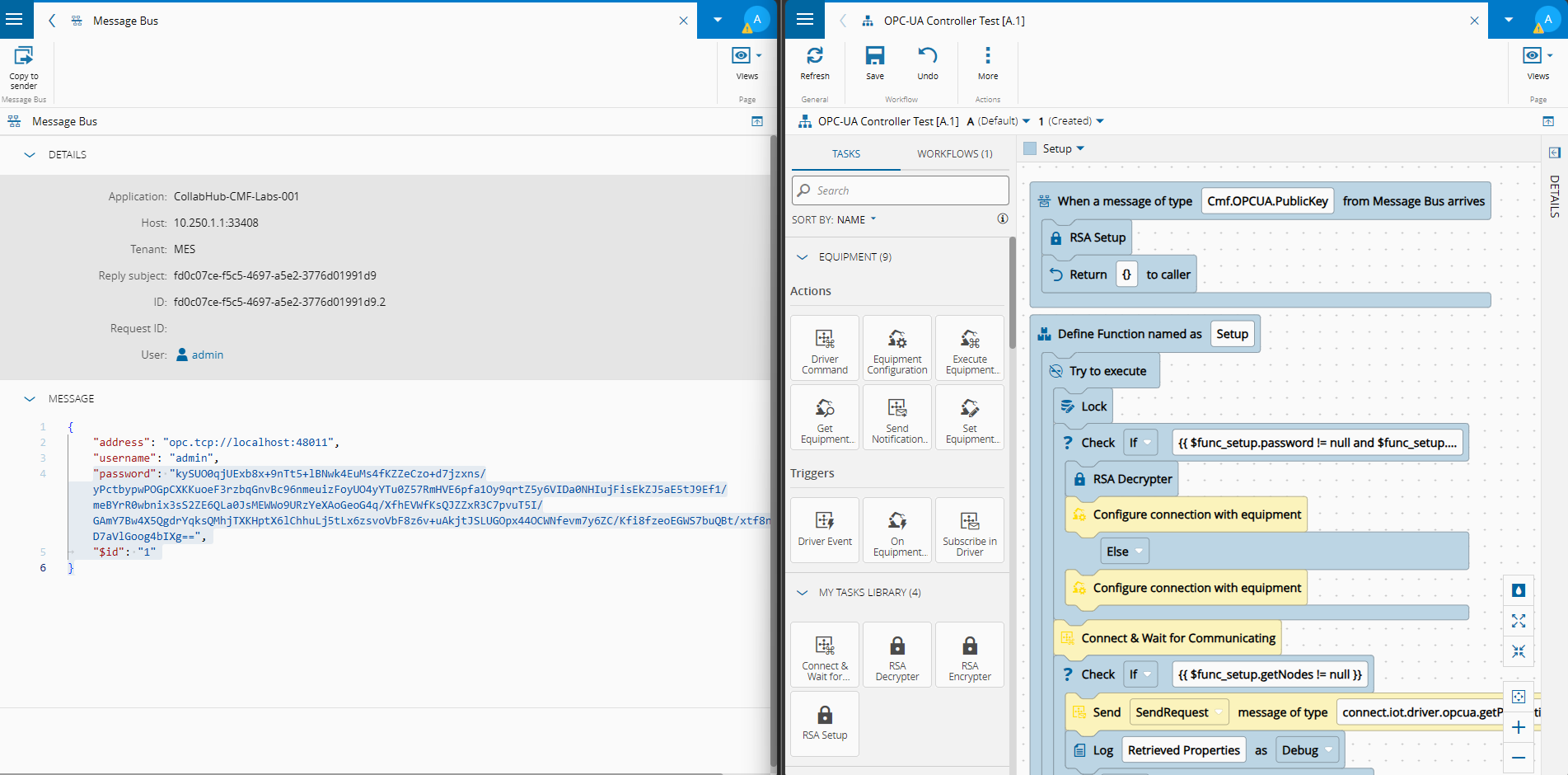
Once visible, the step lets the user enter an OPC-UA server address, optionally provide credentials (which are encrypted with the server’s public key before being sent over the message bus), and browse the node tree:
    public async fetch(): Promise<void> {
        await this.ngZone.run(async () => {
            (...)
            const response = await this.messageBus.sendRequest('Cmf.OPCUA.Browse', {
                address: this.address,
                username: this.username,
                password: this.password,
            }, 30000);

            const reply = JSON.parse(response.Data) as { browse: OpcUaNodeInfo[], message: string };
            this.opcuaTree = reply.browse;
        });
    }
The call goes to the ephemeral OPC-UA controller built in the previous post. The result is a tree of OpcUaNodeInfo objects rendered by the shared OpcuaNodeTreeComponent. The user selects nodes and clicks “Add Properties”, “Add Events” or “Add Commands” — which push entries directly into the wizard’s in-progress AutomationDriver instance.
    <button
        type="button"
        class="cmf-btn"
        [disabled]="selectedNodes.size === 0"
        (click)="addProperties()"
        i18n="@@customization-opcua/wizard-automation-driver-opcua-step#ADD_PROPERTIES">
        Add Properties
    </button>
    public addProperties(): void {
        const instance = this.wizard?.instance;

        if (!instance.Properties) {
            instance.Properties = new Cmf.Foundation.BusinessObjects.AutomationPropertyCollection();
        }

        const existingIds = new Set(instance.Properties.map(p => p.DevicePropertyId));

        for (const nodeId of this.selectedNodes) {
            // Skip if the property already exists. This can happen when adding events, as they reuse the same nodes as properties.
            if (existingIds.has(nodeId)) { continue; }
            const node = this.nodeMap.get(nodeId);

            instance.Properties.push(this.buildProperty(node));
            existingIds.add(nodeId);
        }
        this.feedbackService.success('Properties added successfully.');
    }
    (...)
    private buildProperty(node: OpcUaNodeInfo): Cmf.Foundation.BusinessObjects.AutomationProperty {
        return new Cmf.Foundation.BusinessObjects.AutomationProperty({
            Name: node.displayName || node.browseName,
            DevicePropertyId: node.nodeId,
            DataType: OPCUA_TO_AUTOMATION_DATA_TYPE[node.dataType]
                ?? Cmf.Foundation.BusinessObjects.AutomationDataType.String,
            AutomationProtocolDataType: this.getAutomationProtocolDataType(node.dataType),
            IsReadable: true,
            IsWritable: false
        });
    }
The add properties will fetch the existing instance (in this case the instance is the Automation Driver Definition) properties and if there isn’t already a node created it will add to the current instance.
The add event properties and add commands are very similar, they wil interpret the information from the opc-ua browse and add events and commands to the instance object.
Injecting an Entity Page Tab#
The second extension point is entityTypes. This is how you add a new tab (view) to an existing entity’s detail page.

public override get entityTypes(): EntityTypeMetadata[] {
    return [{
        name: 'AutomationControllerInstance',
        views: [{
            id: 'Custom.AutomationControllerInstancePersistencyViewer',
            name: 'OPC-UA Browser',
            path: 'opc-ua-browser',
            loadComponent: () => import('customization-opcua')
                .then(m => m.PageOpcUaBrowserComponent),
            type: ViewType.Simple,
            canExecute: async (entityTypeName, entityInstance, messages) => {
                (...)
            }
        }]
    }];
}
The structure maps directly to what the platform needs to render a tab:
| Field | Role |
|---|---|
name | The entity type this view attaches to |
id | Unique identifier for the view (used for routing and access control) |
path | URL segment appended to the entity detail route |
loadComponent | Lazy-loaded component factory |
type | ViewType.Simple for a plain component, ViewType.Wizard for a wizard |
canExecute | Async gate — hides the tab entirely if it returns false |
The canExecute Gate#
The OPC-UA browser tab is not useful on every AutomationControllerInstance. We only want it visible when the underlying AutomationManager has been explicitly enabled for it. The gate loads the manager’s entity attributes and checks for the IsOPCUABrowserEnabled attribute flag.
canExecute: async (entityTypeName, entityInstance, messages) => {
    const manager = entityInstance?.AutomationManager;
    if (manager == null) { return true; }

    const { EntityAttributesUtil } = await import('cmf-core-business-controls');
    const entityAttributesUtil = this.injector.get(EntityAttributesUtil);
    const result = await entityAttributesUtil.loadEntityAttributes(manager);
    const managerWithAttributes = result?.Entity as Cmf.Foundation.BusinessObjects.AutomationManager;

    return managerWithAttributes?.Attributes?.has(IS_OPCUA_BROWSER_ENABLED_ATTR)
        && managerWithAttributes.Attributes.get(IS_OPCUA_BROWSER_ENABLED_ATTR) === true;
}
EntityAttributesUtil is itself lazily imported — no unnecessary bundle cost when the tab check runs on an instance that doesn’t even have a manager loaded.
Wiring it Together#
The entry point is CustomizationOpcuaMetadataModule. Register it in your application and the rest happens automatically:
@NgModule({
    providers: [provideCustomizationOpcua()]
})
export class CustomizationOpcuaMetadataModule { }

export function provideCustomizationOpcua(): EnvironmentProviders {
    return makeEnvironmentProviders([
        provideMetadata(CustomizationOpcuaMetadataService)
    ]);
}
provideMetadata registers your PackageMetadata subclass with the platform’s metadata registry. At startup, the platform collects all registered metadata services and calls their getters to assemble the final routing table, flex injection map and action bar configuration.
The entire customization — two new UI surfaces, a shared tree component, and a metadata module — ships as a single versioned Angular library with zero changes to the platform itself.
The Page Component#
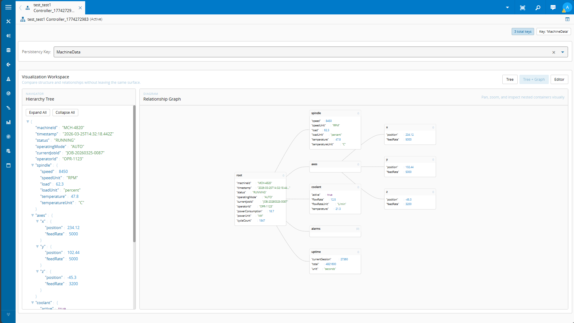
PageOpcUaBrowserComponent is a standalone component extending CustomizableComponent. It mirrors the wizard step’s browse logic but adds a live monitoring panel on the right side of a page splitter: the user selects nodes in the tree, adds them to a monitored list, and the component polls the OPC-UA server at a configurable interval to display current tag values.
@Component({
    standalone: true,
    selector: 'customization-opcua-page-opc-ua-browser',
    imports: [CommonModule, BasePageModule, ActionBarModule, /* ... */, PageSplitterModule],
    viewProviders: [{ provide: HOST_VIEW_COMPONENT, useExisting: forwardRef(() => PageOpcUaBrowserComponent) }]
})
export class PageOpcUaBrowserComponent extends CustomizableComponent implements OnDestroy {

    public monitoredTags: MonitoredTag[] = [];
    public isPolling = false;
    private _pollingHandle: ReturnType<typeof setInterval> | null = null;

    public ngOnDestroy(): void {
        this.stopPolling();
    }

    public async startPolling(): Promise<void> {
        const intervalMs = await this.pollIntervalMs();
        this._pollingHandle = setInterval(() => this.pollTags(), intervalMs);
        this.isPolling = true;
    }

    public stopPolling(): void {
        if (this._pollingHandle != null) {
            clearInterval(this._pollingHandle);
            this._pollingHandle = null;
        }
        this.isPolling = false;
    }
}
The polling interval is read from the platform configuration path /Cmf/System/Configuration/ConnectIoT/OPCUA/PollingInterval, with a fallback of 60 seconds. This means you can tune it per deployment without redeploying the customization.
The Shared Building Block#
Both components reuse OpcuaNodeTreeComponent, a standalone component that wraps the platform’s TreeViewModule and renders the OPC-UA node tree with checkboxes:
export interface OpcUaNodeInfo {
    nodeId: string;
    nodeClass: string;
    browseName: string;
    displayName: string;
    dataType: string;
    value?: unknown;
    children: OpcUaNodeInfo[];
    parentNode: OpcUaNodeInfo | null;
}

@Component({
    selector: 'customization-opcua-node-tree',
    standalone: true,
    imports: [CommonModule, TreeViewModule, CheckboxModule],
})
export class OpcuaNodeTreeComponent {

    @Input() set nodes(value: OpcUaNodeInfo[]) { /* rebuild tree model */ }
    @Input() selectedNodes: Set<string> = new Set();
    @Input() selectedCommands: Set<string> = new Set();
    @Input() showCheckbox: boolean = true;
    @Input() showDataType: boolean = true;
    @Input() showValue: boolean = true;

    @Output() selectionChanged = new EventEmitter<Set<string>>();
    @Output() commandSelectionChanged = new EventEmitter<Set<string>>();
}
Having a separate component allows us to easily reuse it in different contexts, maintaining flexibility on what to show.
One of the key aspect of this component and throughout this implementation is that we try as much as possible to reuse CM MES UI components. This way we can keep the look and feel of the UI and also save time in not having to build the UI from scratch.
The help portal has a whole section dedicated to sandboxing the main MES UI components. For this component we are leveraging the tree view.
    <cmf-core-controls-treeView
        *ngIf="treeModel; else noData"
        [data]="treeModel"
        [showRootNode]="true"
        [nodeSelectionEnabled]="false">
        <ng-template cmf-core-controls-treeView-nodeTemplate let-item>
            <div class="opcua-node-row">
                @if(isLeaf(item)) {
                    <span *ngIf="showValue && item.tag?.value" class="opcua-node-value" [class.opcua-node-value--changed]="changedNodeIds.has(item.id)">{{ item.tag.value }}</span>
                    <span *ngIf="showDataType && item.tag?.dataType" class="opcua-node-type">{{ item.tag.dataType }}</span>
                    <cmf-core-controls-checkbox
                        *ngIf="showCheckbox && item.tag?.parentNodeClass !== 'Method'"
                        [value]="selectedNodes.has(item.id)"
                        (checked)="toggleSelect(item.id, true)"
                        (unchecked)="toggleSelect(item.id, false)">
                    </cmf-core-controls-checkbox>
                } @else {
                    <cmf-core-controls-checkbox
                        *ngIf="showCheckbox && item.tag?.nodeClass === 'Method'"
                        class="opcua-command-checkbox"
                        [value]="selectedCommands.has(item.id)"
                        (checked)="toggleCommand(item.id, true)"
                        (unchecked)="toggleCommand(item.id, false)">
                    </cmf-core-controls-checkbox>
                }
            </div>
        </ng-template>
    </cmf-core-controls-treeView>
We can check all the component details by searching in the reference documentation.
In order to populate our tree we just need to make sure we are building a TreeViewModel with Leafs and Nodes.
    treeModel: TreeViewModel | null = null;
    (...)
    private buildTreeModel(nodes: OpcUaNodeInfo[], openIds: Set<string> | null): TreeViewModel {
        return {
            rootNode: {
                id: '__opcua_root__',
                name: 'OPC-UA Server',
                iconClass: 'icon-core-et-lg-folder',
                // On first load openIds is null — omit isOpen so the tree defaults to open.
                // On refresh, explicitly restore the previous state.
                ...(openIds != null && { isOpen: openIds.has('__opcua_root__') }),
                children: nodes.map(n => this.toTreeItem(n, openIds, null)),
            } as TreeViewModelNode,
        };
    }

    private toTreeItem(node: OpcUaNodeInfo, openIds: Set<string> | null, parentNode: OpcUaNodeInfo | null): TreeViewModelNode | TreeViewModelLeaf {
        const iconClass = this.getNodeIconClass(node, parentNode);
        const tag = { ...node, parentNodeClass: parentNode?.nodeClass ?? null };
        if (node.children.length > 0) {
            return {
                id: node.nodeId,
                name: node.displayName || node.browseName,
                iconClass: iconClass,
                ...(openIds != null && { isOpen: openIds.has(node.nodeId) }),
                tag,
                children: node.children.map(c => this.toTreeItem(c, openIds, node)),
            } as TreeViewModelNode;
        }
        return {
            id: node.nodeId,
            name: node.displayName || node.browseName,
            iconClass: iconClass,
            tag,
        } as TreeViewModelLeaf;
    }
In our new component we added the tree building and toggle logic, and also some visual flexibility to hide and show different parts of it. We are also leveraging the CM MES icons.
The wizard step uses it with [showValue]="false" since there are no live values at driver-creation time.
The page component uses it with [showDataType]="false" on the browse panel to save horizontal space. Same component, different configuration.
Final Thoughts#
The two patterns shown here — flexComponents for injecting into existing views, entityTypes for attaching new views to entities — cover the vast majority of real customization scenarios. The OPC-UA browser crosses wizard context injection, conditional step visibility, entity attribute gating, lazy loading, and shared component reuse, with one goal: make life simpler for the end-user.
The patterns themselves are protocol-agnostic. Replace the OPC-UA message bus calls with anything else and the injection mechanics remain identical.